
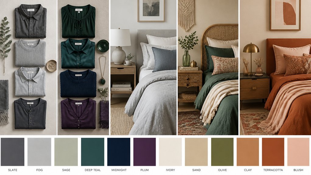
Finding the right wardrobe color means thinking about the overall feel of your bedroom rather than following rigid rules.
Neutral shades like white and beige naturally suit minimalist spaces, creating that calm, uncluttered atmosphere many people crave.
Earthy tones such as warm browns and terracotta work beautifully in rustic settings, adding depth without overwhelming the room.
Luxurious bedrooms often call for something bolder.
Jewel tones like emerald green and sapphire blue bring a sense of opulence that pairs well with rich textures and metallic accents. These colors catch the light in interesting ways and can transform a simple storage piece into something that feels intentionally designed.
Coastal aesthetics benefit from a lighter touch.
Soft pastels, particularly seafoam and pale blue, enhance that breezy, relaxed quality people associate with beachside living.
The key is selecting wardrobe colors that create visual harmony throughout your personal space while still reflecting your individual taste and lifestyle needs.
Neutral Wardrobes for Minimalist Bedrooms
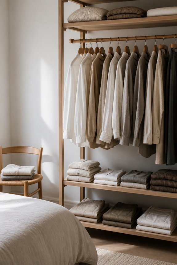
Neutral color wardrobes form the foundation of minimalist bedroom design, creating calm and uncluttered spaces through restrained palettes. White, beige, gray, and taupe serve as primary color choices, offering visual simplicity and flexibility. These tones pair well with natural materials like wood and linen, enhancing the minimalist aesthetic.
When selecting wardrobe pieces, consider soft whites for doors, warm grays for frames, and natural wood finishes for structure. Neutral wardrobes reduce visual noise, making bedrooms feel more spacious and organized. This approach allows bedding, artwork, and accessories to become focal points without competing colors, establishing coherent, peaceful environments suitable for rest.
Earthy Tones for Rustic Retreats
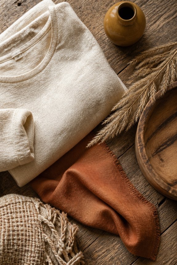
Because rustic bedroom designs draw inspiration from natural landscapes and traditional craftsmanship, wardrobe color selections should reflect earthy, grounded tones. Warm browns, terracotta, olive green, and warm beige create visual harmony with wooden furniture, stone textures, and natural materials commonly found in rustic spaces. These colors evoke natural elements like soil, clay, and vegetation.
Clothing in these hues complements the overall aesthetic without creating visual discord. Rust, mustard yellow, and deep cream work well alongside rustic décor. Avoiding bright, synthetic colors maintains the cohesive, nature-inspired environment. Layering different earth tones adds depth and visual interest to wardrobes designed for rustic bedroom settings.
Jewel Tones for Luxe Bedrooms
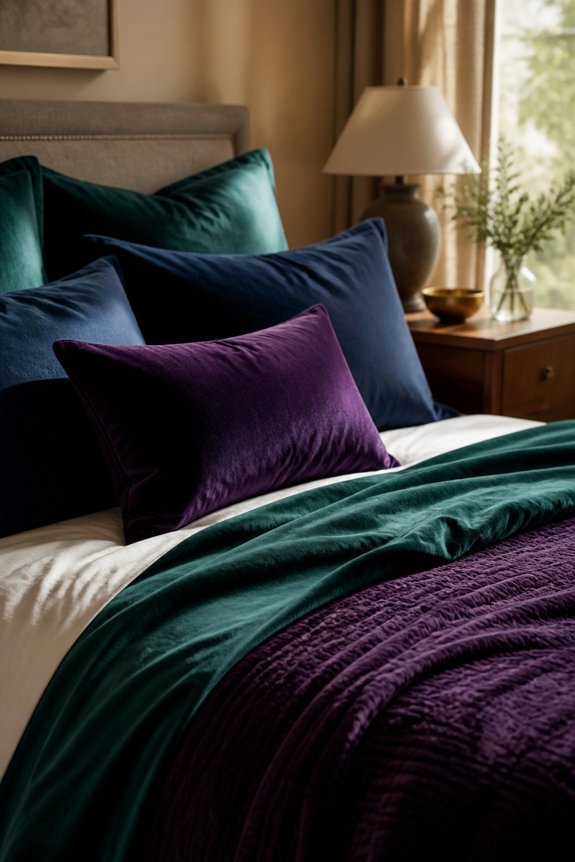
Luxury bedroom designs call for wardrobe colors that convey sophistication and richness, making jewel tones an appropriate choice for these spaces. Deep jewel shades, including emerald green, sapphire blue, amethyst purple, and ruby red, complement high-end bedroom aesthetics effectively. These colors pair well with metallic accents, such as gold and silver accessories, creating visual harmony.
Clothing in jewel tones works particularly well alongside luxurious fabrics like velvet, silk, and satin, which are common in upscale bedrooms. Rich jewel-toned garments, including robes, loungewear, and evening wear, enhance the overall sophisticated atmosphere of these carefully designed spaces.
Coastal Colours: Whites and Pastels
Coastal bedroom designs employ a distinctly different palette than luxurious jewel-toned spaces, favoring whites, creams, and soft pastels instead. This approach creates airy, relaxed environments suited to seaside aesthetics.
Wardrobe colors should include ivory, light gray, pale blue, and soft seafoam green. These neutral tones complement sandy, weathered furniture and nautical accents effectively. Soft blush pink and pale yellow also work well within this scheme.
Accessories in whites and off-whites maintain visual cohesion throughout the space. The resulting environment feels calm and open, reflecting typical coastal sensibilities and providing a serene backdrop for daily activities.
Matching Your Clothes to Your Room: A Visual Checklist
How can one guarantee that wardrobe selections align with bedroom design choices? A visual checklist provides systematic comparison.
First, identify dominant bedroom colors: walls, bedding, furniture, accents. Next, photograph these hues for reference. Then, hold clothing items against the photos, noting compatibility. Consider undertones; warm neutrals pair with cream bedrooms, cool grays with blue rooms.
Create categories: matching pieces, complementary shades, neutral basics. Document successful combinations through photos. Review seasonal adjustments needed. Check lighting effects, as artificial light alters color perception. Maintain a digital reference file for quick coordination during dressing decisions, ensuring coherent aesthetic continuity.
Room Colours That Suit Your Complexion
When selecting bedroom colors, individuals should consider how their skin tone interacts with wall hues, as certain shades enhance natural coloring while others create visual discord. Fair complexions typically pair well with cool tones like soft blues, lavenders, and pale greens, which provide gentle contrast. Medium skin tones complement warm neutrals such as beige, taupe, and warm grays, creating balanced environments.
Deeper complexions benefit from rich jewel tones, including emerald, sapphire, and burgundy, which provide striking visual harmony. Olive undertones work effectively with muted golds and sage greens. Selecting wall colors that complement skin tone improves overall bedroom aesthetics and personal appearance within the space.
Bedroom-Inspired Patterns and Fabrics for Your Wardrobe
Just as bedroom colors enhance personal spaces, patterns and fabrics selected from bedroom design can improve everyday clothing choices.
Floral prints, common in cottage and traditional bedrooms, translate well to blouses and dresses. Geometric patterns from modern bedroom designs work effectively in structured garments like blazers and trousers.
Linen and cotton fabrics, popular bedroom materials, offer breathable comfort for everyday wear. Velvet accents from luxury bedroom styles add sophistication to cardigans and accessories.
Striped patterns from nautical bedroom themes suit casual shirts and sweaters. Selecting wardrobe pieces featuring bedroom-inspired patterns and textures creates visual consistency between personal environments and daily appearance.
Frequently Asked Questions
How Do I Transition My Wardrobe When Changing Bedroom Styles Seasonally?
One shifts seasonal bedroom styles by gradually rotating clothing storage solutions and color palettes. They select neutral base pieces, introduce accent colors matching new décor, and organize wardrobes into labeled containers. This method maintains aesthetic cohesion while allowing flexible seasonal adjustments without complete wardrobe overhauls.
Can I Mix Wardrobe Colors From Different Bedroom Style Palettes Together?
Notably, one discovers that blending color palettes from different bedroom aesthetics proves entirely feasible. By selecting neutral anchors and complementary accent pieces, individuals successfully create cohesive wardrobes that transcend singular style boundaries, allowing personal expression through thoughtful color coordination.
What Budget-Friendly Options Exist for Updating Clothes to Match Bedroom Redesigns?
Budget-friendly wardrobe updates include shopping thrift stores for affordable pieces, dyeing existing clothes to match new bedroom palettes, swapping items with friends, shopping sales at discount retailers, and gradually replacing basics rather than purchasing entire new collections simultaneously.
How Do Lighting Conditions in Bedrooms Affect How Wardrobe Colors Actually Appear?
Like shadows dancing across a stage, bedroom lighting dramatically transforms color perception. Warm artificial light yellows cooler tones, while natural daylight reveals true hues. Dim lighting mutes saturation; bright conditions enhance vibrancy, making wardrobe selection dependent on specific illumination.
Should I Prioritize Bedroom or Personal Style When Selecting Wardrobe Colors?
Personal style should take priority when selecting wardrobe colors. The bedroom serves as a backdrop, but clothing worn throughout various environments demands versatility. One’s individual preferences and skin tone create a foundation for choices that transcend any single room’s aesthetic.
Conclusion
Selecting wardrobe colors that complement bedroom styles creates visual harmony throughout personal spaces. Neutral tones, earthy hues, jewel tones, and coastal palettes each serve specific aesthetic purposes. By coincidence, the colors that enhance bedroom environments often flatter individual complexions, making this alignment doubly beneficial. Coordinating clothing with bedroom design establishes cohesion, reduces decision fatigue, and strengthens overall home aesthetics. Intentional color selection bridges fashion and interior design effectively.